Animated Radar Chart in React Native
Posted in react-native-animations, radar-chart on May 2, 2025 by Hemanta Sapkota ‐ 13 min read
Learn how to build a fully animated radar chart in React Native using Reanimated and SVG with TypeScript
Radar charts (also known as spider or web charts) are a powerful way to visualize multivariate data in a compact 2D representation. They’re especially useful for comparing multiple data points across several variables simultaneously.
In this tutorial, we’ll build a fully animated radar chart component for React Native using React Native Reanimated and SVG.
Prerequisites
Before getting started, make sure you have:
- A React Native project initialized with TypeScript
- React Native Reanimated and React Native SVG installed
# Install dependencies
npm install react-native-reanimated react-native-svg
# or with yarn
yarn add react-native-reanimated react-native-svg

# For React Native Reanimated, additional setup is required
# Add the Reanimated plugin to your babel.config.js
module.exports = {
  presets: ['module:metro-react-native-babel-preset'],
  plugins: ['react-native-reanimated/plugin'],
};
After installation, rebuild your app:
# For iOS
cd ios && pod install && cd ..
# Rebuild
npx react-native run-ios

# For Android
npx react-native run-android
Requirements Analysis
Let’s analyze key requirements for an effective radar chart component:
- Multiple Datasets: Display and compare multiple data series simultaneously with different colors
- Smooth Animations: Fluid entry animations powered by React Native Reanimated
- Customizable Appearance:
- Adjustable web color and line width
- Configurable axis and label styling
- Custom colors for each dataset
- Control over point size and appearance
- Flexible Layout:
- Adjustable chart size via style prop
- Configurable rotation angle to orient the chart as needed
- Performance Optimized: Efficient rendering even with complex datasets
- TypeScript Support: Full type definitions for improved development experience
- Responsive Design: Adapts to different screen sizes and orientations
- Accessibility Friendly: Proper contrast and sizing for better readability
- Custom Animation Controls:
- Configurable animation duration
- Animation easing functions
- Interactive Elements: Support for touch events on data points (can be extended)
Understanding Radar Chart Geometry
Before diving into the code, let’s understand the geometry of a radar chart:
- It’s built on a circular grid with multiple axes extending from the center
- Each axis represents a variable or category
- Data points are plotted along each axis based on their values
- Lines connect these points to create a polygon representing a dataset
The key to mapping data to the radar chart is converting values to coordinates using:
x = centerX + radius * (value / maxValue) * Math.cos(angle)
y = centerY + radius * (value / maxValue) * Math.sin(angle)
Where:
centerXandcenterYare the center coordinates of the chartradiusis the maximum distance from centervalue / maxValuenormalizes the data to a 0-1 scaleangleis the position on the radar (calculated as 2π * index / totalAxes)
Step 1: Setting Up the Component Structure
Let’s start by defining our component and its props:
| Type | Description | Properties |
|---|---|---|
Point | Represents a point on the radar chart | x: number - X coordinatey: number - Y coordinatevalue: number - Original data value |
DataSetValue | Represents a single data value | value: number - The numeric value |
DataSet | Represents a complete dataset for the chart | values: (number | DataSetValue)[] - Array of valueslabel?: string - Optional dataset labelconfig?: { colors?: string[], color?: string } - Visual configurationcolor?: string - Dataset colorpoints?: Point[] - Calculated points |
ChartData | Main data structure for the chart | dataSets?: DataSet[] - Array of datasetslabels?: string[] - Axis labelsmaxValue?: number - Maximum value for scaling |
XAxisConfig | Configuration for the X-axis | drawLabels: boolean - Whether to show labelstextColor: string - Color of label textvalueFormatter?: string[] - Custom label formatting |
AnimationConfig | Animation settings | durationX: number - Duration in millisecondsdurationY?: number - Optional Y-axis animation duration |
AnimatedRadarChartProps | Main component props | rotationAngle?: number - Chart rotationanimation?: AnimationConfig - Animation settingsstyle?: ViewStyle - Container stylesdata?: ChartData - Chart dataxAxis?: XAxisConfig - Axis configurationwebLineWidth?: number - Web line thicknesswebColor?: string - Web line colorwebLineWidthInner?: number - Inner web line thicknesswebColorInner?: string - Inner web line colorskipWebLineCount?: number - Number of web lines to skipdrawWeb?: boolean - Whether to draw the webchartBackgroundColor?: string - Background color |
Let’s create a basic implementation with our component structure:
import React, { useMemo, useEffect, useState, useRef } from 'react';
import { View, StyleSheet, Dimensions, ViewStyle } from 'react-native';
import Animated, {
  useSharedValue,
  withTiming,
  useAnimatedProps,
  interpolate,
  Extrapolate
} from 'react-native-reanimated';
import Svg, { Polygon, Line, Circle, Text, G, TextAnchor } from 'react-native-svg';

// Define interfaces for better type safety
interface Point {
  x: number;
  y: number;
  value: number;
}

interface DataSetValue {
  value: number;
}

interface DataSet {
  values: (number | DataSetValue)[];
  label?: string;
  config?: {
    colors?: string[];
    color?: string;
  };
  color?: string;
  points?: Point[];
}

interface ChartData {
  dataSets?: DataSet[];
  labels?: string[];
  maxValue?: number;
}

interface XAxisConfig {
  drawLabels: boolean;
  textColor: string;
  valueFormatter?: string[];
}

interface AnimationConfig {
  durationX: number;
  durationY?: number;
}

interface AnimatedRadarChartProps {
  rotationAngle?: number;
  animation?: AnimationConfig;
  style?: ViewStyle;
  data?: ChartData;
  xAxis?: XAxisConfig;
  webLineWidth?: number;
  webColor?: string;
  webLineWidthInner?: number;
  webColorInner?: string;
  skipWebLineCount?: number;
  drawWeb?: boolean;
  chartBackgroundColor?: string;
}

const AnimatedPolygon = Animated.createAnimatedComponent(Polygon);
Our component has a flexible props structure that allows customization of colors, animations, and chart appearance.
Step 2: Creating the Base Component
Now, let’s scaffold the main component function:
export const AnimatedRadarChart = ({
  rotationAngle = 0,
  animation = { durationX: 1000 },
  style = {},
  data = { dataSets: [] },
  xAxis = { drawLabels: true, textColor: '#000000' },
  webLineWidth = 1,
  webColor = '#CCCCCC',
  webLineWidthInner = 1,
  webColorInner = '#CCCCCC',
  skipWebLineCount = 0,
  drawWeb = true,
  chartBackgroundColor = '#FFFFFF'
}: AnimatedRadarChartProps) => {
  const defaultDimensions = Dimensions.get('window');
  const width = (style as any).width || defaultDimensions.width;
  const height = (style as any).height || defaultDimensions.height / 2.5;
  const centerX = width / 2;
  const centerY = height / 2;
  const radius = Math.min(centerX, centerY) * 0.8;

  // Remaining implementation...
}
Step 3: Creating the Web Background
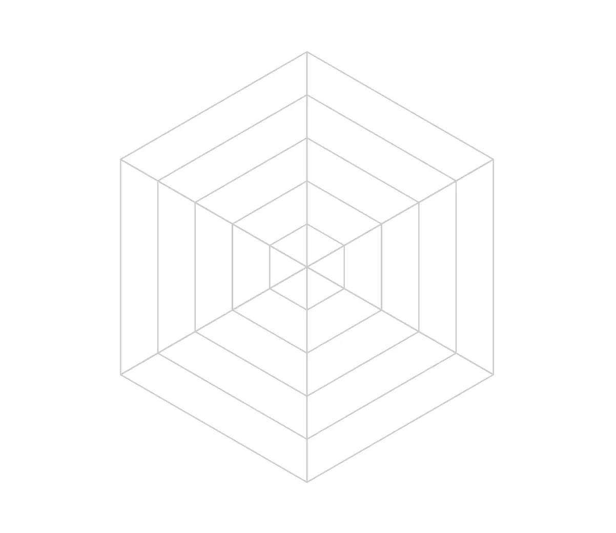
The radar chart’s background consists of concentric webs and axis lines:
const webPoints = useMemo(() => {
  const numAxes = data?.dataSets?.[0]?.values?.length || 0;
  if (!numAxes) return [];

  const webs = [];
  const gridLevels = 5; // Number of concentric webs

  for (let level = 1; level <= gridLevels; level++) {
    const scaleFactor = level / gridLevels;
    const points = [];

    for (let i = 0; i < numAxes; i++) {
      const angle = (2 * Math.PI * i / numAxes) - Math.PI / 2;
      const x = centerX + radius * scaleFactor * Math.cos(angle);
      const y = centerY + radius * scaleFactor * Math.sin(angle);
      points.push({ x, y });
    }

    webs.push(points);
  }

  return webs;
}, [centerX, centerY, radius, data]);

const axisLines = useMemo(() => {
  const numAxes = data?.dataSets?.[0]?.values?.length || 0;
  if (!numAxes) return [];

  const lines = [];
  for (let i = 0; i < numAxes; i++) {
    if (skipWebLineCount > 0 && i % (skipWebLineCount + 1) !== 0) continue;

    const angle = (2 * Math.PI * i / numAxes) - Math.PI / 2;
    const x = centerX + radius * Math.cos(angle);
    const y = centerY + radius * Math.sin(angle);
    lines.push({ x1: centerX, y1: centerY, x2: x, y2: y });
  }

  return lines;
}, [centerX, centerY, radius, data, skipWebLineCount]);
This creates:
- Concentric polygons for the web background
- Axis lines radiating from the center to each variable’s position
Step 4: Transforming Data to Chart Points
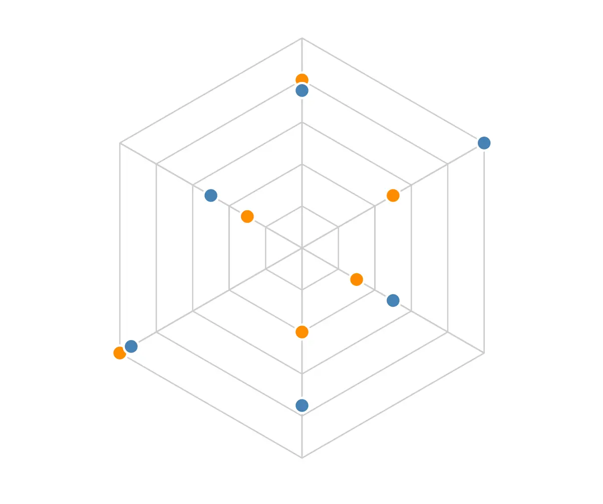
The heart of our radar chart is the data transformation logic:
const processedData = useMemo(() => {
  if (!data?.dataSets?.length) return [];

  return data.dataSets.map((dataset: DataSet) => {
    // Handle both object and number value formats
    const rawValues = dataset.values || [];
    const values = rawValues.map((v: number | DataSetValue) =>
      typeof v === 'number' ? { value: v } : v
    );

    // Use labels from parent data if available
    const labels = data.labels || [];
    const maxValue = data.maxValue !== undefined
      ? data.maxValue
      : Math.max(...values.map((v: DataSetValue) => v.value), 1);

    const points = values.map((value: DataSetValue, index: number) => {
      // THIS IS THE CORE FORMULA FOR RADAR CHARTS
      const angle = (2 * Math.PI * index / values.length) - Math.PI / 2;
      const normalizedValue = value.value / maxValue;
      const x = centerX + radius * normalizedValue * Math.cos(angle);
      const y = centerY + radius * normalizedValue * Math.sin(angle);
      return { x, y, value: value.value };
    });

    // Handle different color formats
    const datasetColor = dataset.config?.colors?.[0] || dataset.color;

    return {
      ...dataset,
      points,
      color: getColor(datasetColor),
      label: dataset.label || ''
    };
  });
}, [data, centerX, centerY, radius]);
This code:
- Processes each dataset from our input data
- Normalizes values to the 0-1 range
- Converts each value to x,y coordinates using polar-to-cartesian conversion
- Handles multiple data formats and color configurations
Tracing the Transformation
Let’s trace through the transformation process for a sample dataset with values [80, 50, 30, 40, 100, 30] to better understand how the radar chart coordinates are calculated.
Assuming:
maxValueis 100 (the highest value in our dataset)centerXandcenterYare both 175 (center of a 350x350 chart)radiusis 150
Here’s how each point would be calculated:
| Point | Value | Index | Angle | Normalized Value | X Calculation | Y Calculation | Final (x,y) |
|---|---|---|---|---|---|---|---|
| First | 80 | 0 | -90° (-π/2 radians) | 80/100 = 0.8 | 175 + 150 * 0.8 * cos(-π/2) = 175 + 150 * 0.8 * 0 = 175 | 175 + 150 * 0.8 * sin(-π/2) = 175 + 150 * 0.8 * (-1) = 175 - 120 = 55 | (175, 55) |
| Second | 50 | 1 | -30° (-π/2 + 2π/6 radians) | 50/100 = 0.5 | 175 + 150 * 0.5 * cos(-π/2 + 2π/6) = 175 + 150 * 0.5 * 0.5 = 175 + 37.5 = 212.5 | 175 + 150 * 0.5 * sin(-π/2 + 2π/6) = 175 + 150 * 0.5 * (-0.866) = 175 - 65 = 110 | (212.5, 110) |
| Third | 30 | 2 | 30° (-π/2 + 4π/6 radians) | 30/100 = 0.3 | 175 + 150 * 0.3 * cos(-π/2 + 4π/6) = 175 + 150 * 0.3 * 0.866 = 175 + 39 = 214 | 175 + 150 * 0.3 * sin(-π/2 + 4π/6) = 175 + 150 * 0.3 * (-0.5) = 175 - 22.5 = 152.5 | (214, 152.5) |
And so on for the remaining points. This transformation maps each data value to a position on the radar chart, creating the characteristic polygon shape that represents our dataset.
Step 5: Adding Axis Labels
We’ll add labels around the chart to identify each variable:
const axisLabels = useMemo(() => {
  if (!xAxis.drawLabels) return [];

  const numAxes = data?.dataSets?.[0]?.values?.length || 0;
  const labels = data.labels || Array.from({ length: numAxes }).map((_, i) => `Axis ${i + 1}`);

  // Use valueFormatter if provided
  const textLabels = xAxis.valueFormatter || labels;

  return Array.from({ length: numAxes }).map((_, index) => {
    const angle = (2 * Math.PI * index / numAxes) - Math.PI / 2;
    const padding = 20;
    const x = centerX + (radius + padding) * Math.cos(angle);
    const y = centerY + (radius + padding) * Math.sin(angle);

    // Adjust text anchoring for better positioning
    const textAnchor =
      angle === -Math.PI / 2 ? 'middle' as TextAnchor :
      angle > -Math.PI / 2 && angle < Math.PI / 2 ? 'start' as TextAnchor : 'end' as TextAnchor;

    return {
      x,
      y,
      textAnchor,
      text: textLabels[index] || labels[index] || `Axis ${index + 1}`
    };
  });
}, [centerX, centerY, radius, data, xAxis]);
Step 6: Rendering the Polygons
Now we need to render the polygons that represent our data values, creating the characteristic filled shapes that make radar charts visually informative and easy to interpret.
const renderDirectPolygons = () => {
  return processedData.map((dataset, i) => (
    <Polygon
      key={`dataset-${i}-${forceRenderKey}`}
      points={dataset.points
        .map(point => `${point.x},${point.y}`)
        .join(' ')}
      fill={dataset.color}
      fillOpacity={0.3}
      stroke={dataset.color}
      strokeWidth={2.5}
    />
  ));
};
Step 7: Animating the Polygons
For a more engaging user experience, we’ll animate the radar chart polygons when they first appear. Instead of using static polygons, we’ll use Reanimated’s animation capabilities:
// Create an animated version for each dataset
const renderAnimatedPolygons = () => {
  return processedData.map((dataset, i) => {
    // Setup animated props using useAnimatedProps
    const animatedProps = useAnimatedProps(() => {
      'worklet';
      // Map each point from center to its final position
      const pointsString = dataset.points.map((point) => {
        // Calculate animated position using interpolation
        const scaledX = interpolate(
          animationProgress.value,
          [0, 1],
          [centerX, point.x], // Start at center, end at final position
          Extrapolate.CLAMP
        );
        const scaledY = interpolate(
          animationProgress.value,
          [0, 1],
          [centerY, point.y],
          Extrapolate.CLAMP
        );
        return `${scaledX},${scaledY}`;
      }).join(' ');

      return {
        points: pointsString,
        // Fade in the polygon as it expands
        fillOpacity: 0.3 * animationProgress.value,
        stroke: dataset.color,
        strokeWidth: 2.5,
      };
    });

    // Apply animated props to the polygon
    return (
      <AnimatedPolygon
        key={`dataset-${i}-${forceRenderKey}`}
        fill={dataset.color}
        animatedProps={animatedProps}
      />
    );
  });
};
The animation works by:
- Starting all points at the center of the chart (centerX, centerY)
- Gradually interpolating each point to its final position based on the data value
- Simultaneously fading in the polygon for a smoother effect
- Using worklets to ensure the animation runs on the UI thread for optimal performance
Step 8: Rendering the Complete Chart
Finally, we bring everything together in the render method:
return (
  <View style={[styles.container, style, { backgroundColor: chartBackgroundColor }]}>
    <Svg width={width} height={height}>
      <G transform={`rotate(${rotationAngle}, ${centerX}, ${centerY})`}>
        {/* Render the web background */}
        {drawWeb && webPoints.map((web, i) => (
          <G key={`web-${i}`}>
            <Polygon
              points={web.map(p => `${p.x},${p.y}`).join(' ')}
              fill="none"
              stroke={getColor(webColorInner)}
              strokeWidth={webLineWidthInner}
            />
          </G>
        ))}

        {/* Render axis lines */}
        {drawWeb && axisLines.map((line, i) => (
          <Line
            key={`axis-${i}`}
            x1={line.x1}
            y1={line.y1}
            x2={line.x2}
            y2={line.y2}
            stroke={getColor(webColor)}
            strokeWidth={webLineWidth}
          />
        ))}

        {/* Render data polygons with animation */}
        {renderAnimatedPolygons()}

        {/* Render data points */}
        {processedData.map((dataset, i) =>
          dataset.points?.map((point, j) => (
            <Circle
              key={`point-${i}-${j}`}
              cx={point.x}
              cy={point.y}
              r={5}
              fill={dataset.color}
              stroke="#FFFFFF"
              strokeWidth={1.5}
            />
          ))
        )}

        {/* Render axis labels */}
        {axisLabels.map((label, i) => (
          <Text
            key={`label-${i}`}
            x={label.x}
            y={label.y}
            textAnchor={label.textAnchor}
            alignmentBaseline="middle"
            fontSize="12"
            fontWeight="bold"
            fill={getColor(xAxis.textColor)}
          >
            {label.text}
          </Text>
        ))}
      </G>
    </Svg>
  </View>
);
Complete the component with styles:
const styles = StyleSheet.create({
  container: {
    justifyContent: 'center',
    alignItems: 'center',
  },
});
Using the Animated Radar Chart
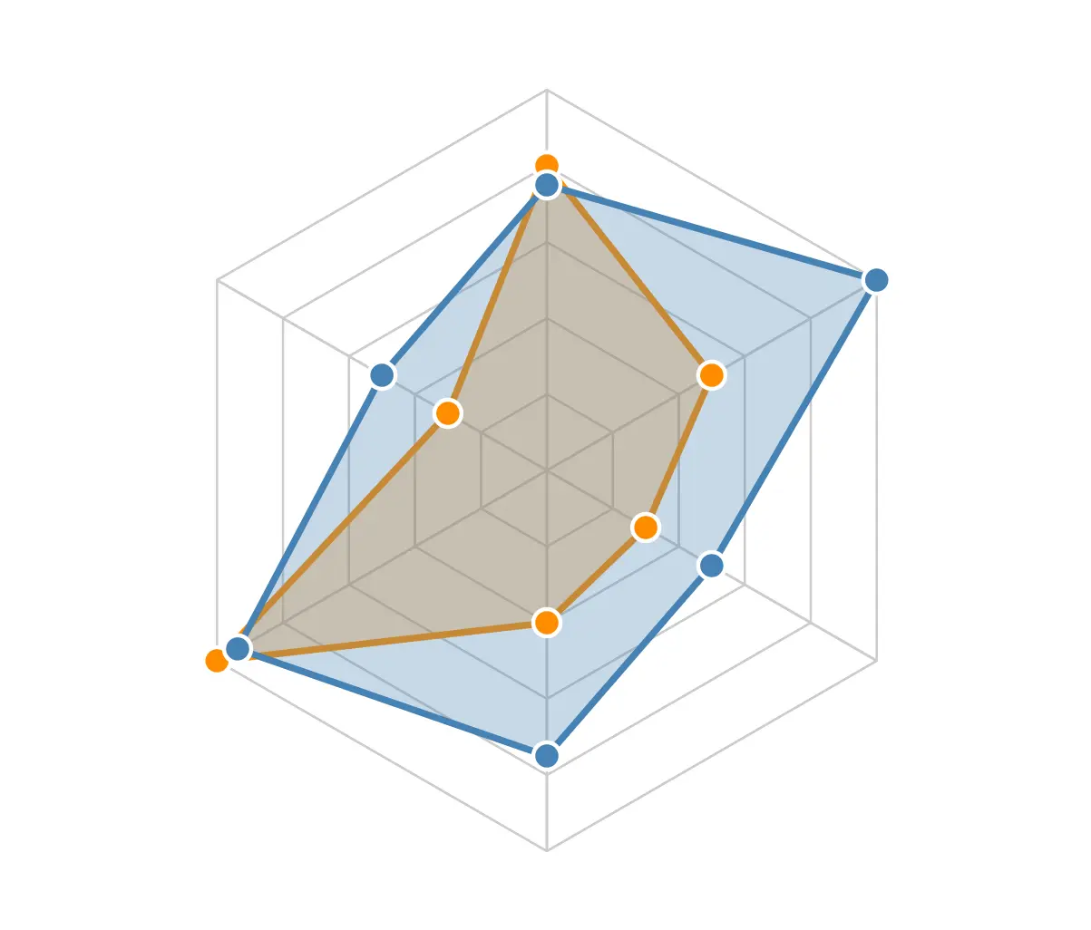
Here’s how to use our component in your app:
import React from 'react';
import { View, StyleSheet } from 'react-native';
import { AnimatedRadarChart } from './AnimatedRadarChart';

const RadarChartExample = () => {
  const data = {
    dataSets: [
      {
        values: [80, 50, 30, 40, 100, 30],
        label: 'Dataset 1',
        color: '#FF8C00'
      },
      {
        values: [60, 80, 40, 60, 75, 40],
        label: 'Dataset 2',
        color: '#4682B4'
      }
    ],
    labels: ['Speed', 'Power', 'Range', 'Agility', 'Stamina', 'Intelligence']
  };

  return (
    <View style={styles.container}>
      <AnimatedRadarChart
        data={data}
        style={{ width: 350, height: 350 }}
        animation={{ durationX: 2000 }}
        webColor="#CCCCCC"
        rotationAngle={0}
      />
    </View>
  );
};

const styles = StyleSheet.create({
  container: {
    flex: 1,
    justifyContent: 'center',
    alignItems: 'center',
    backgroundColor: '#F5FCFF',
  },
});

export default RadarChartExample;
Extending the Component
You can extend this radar chart with additional features such as:
- Touch interaction: Add touch handlers to data points to display detailed information
- Legend component: Create a custom legend to identify each dataset
- Dynamic data: Implement real-time data updates with smooth transitions
- Additional customization: Add more props for customizing point size, stroke width, etc.
Conclusion
In this tutorial, we’ve built a flexible, animated radar chart component for React Native. The key insights we covered:
- Data transformation: Converting raw values to radar coordinates using polar geometry
- Chart construction: Creating the web background, axis lines, polygons, and labels
- Animation: Using React Native Reanimated for smooth transitions
- Customization: Designing a flexible props structure for colors, styles, and animations
This radar chart component is highly customizable and can be adapted to various visualization needs. By understanding the math behind the radar chart, you can further enhance it with additional features like touch interactions, legends, or dynamic data updates.
The full source code is available in the component file above. Experiment with different data sets and configurations to create beautiful, informative visualizations in your React Native apps!
comments powered by Disqus